Discipline:
Art Direction
Branding
Digital
Client:
Year:
St. Leo
2019

St. Leo

Brand creation for Denmark’s finest paint + plaster.

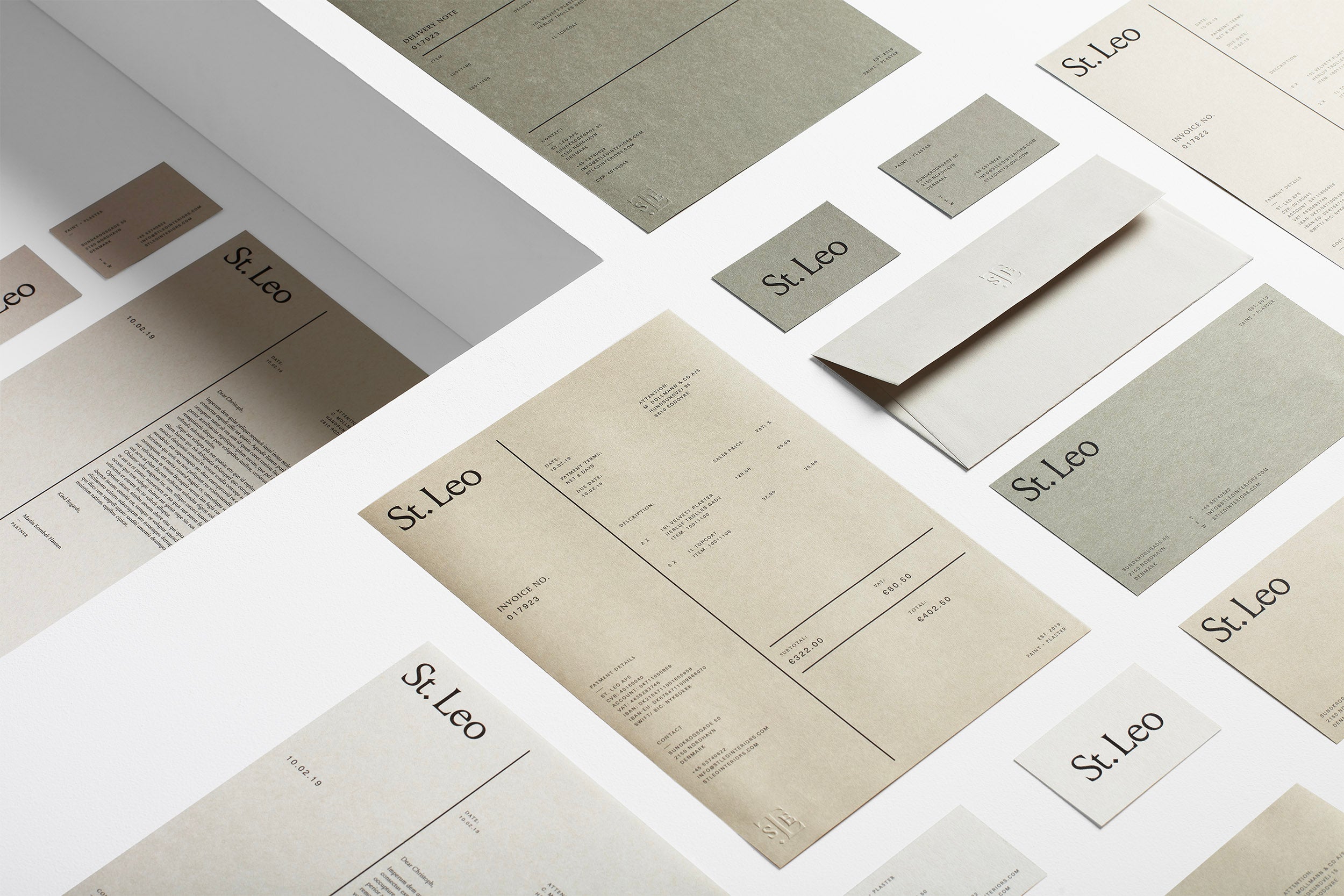
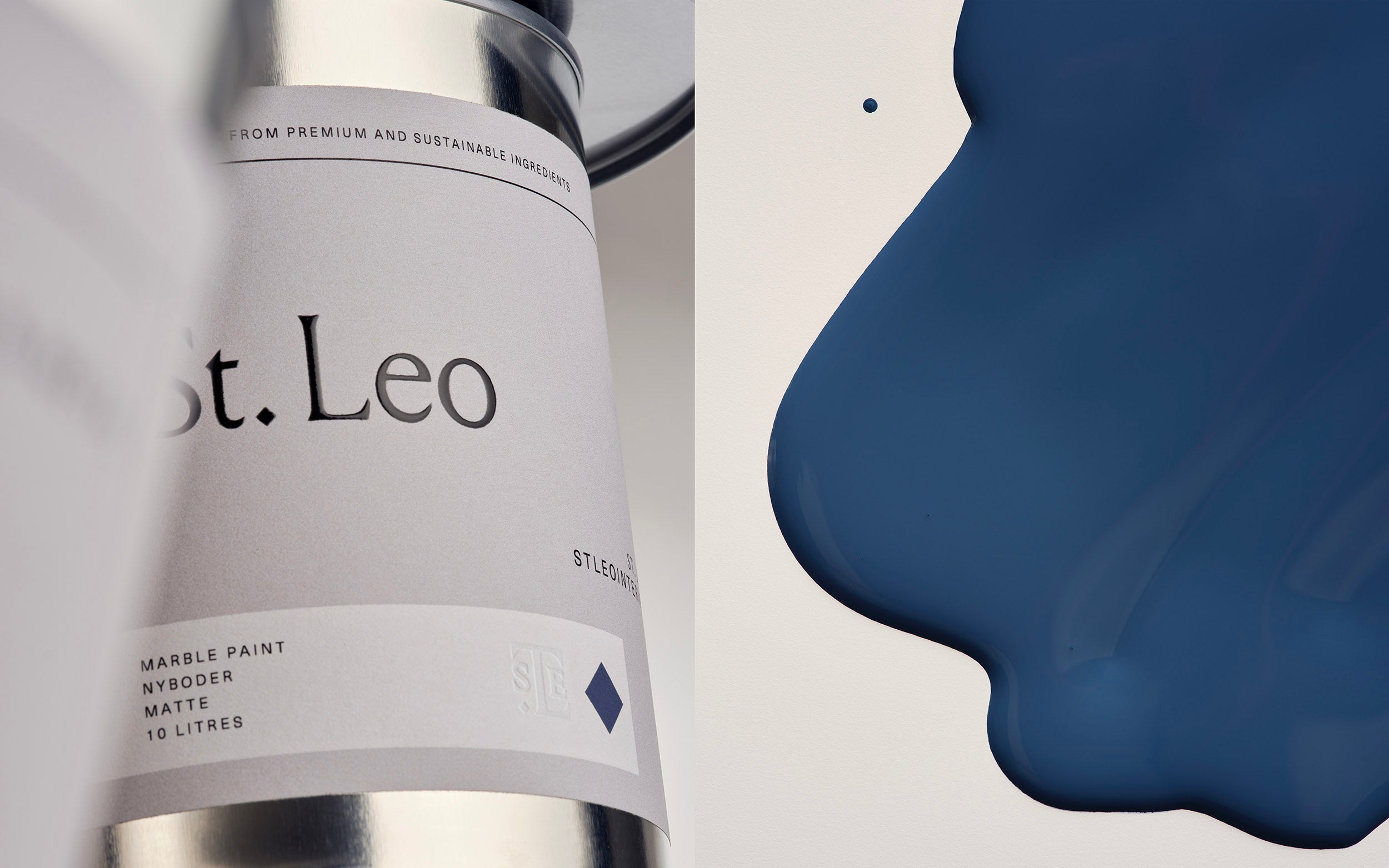
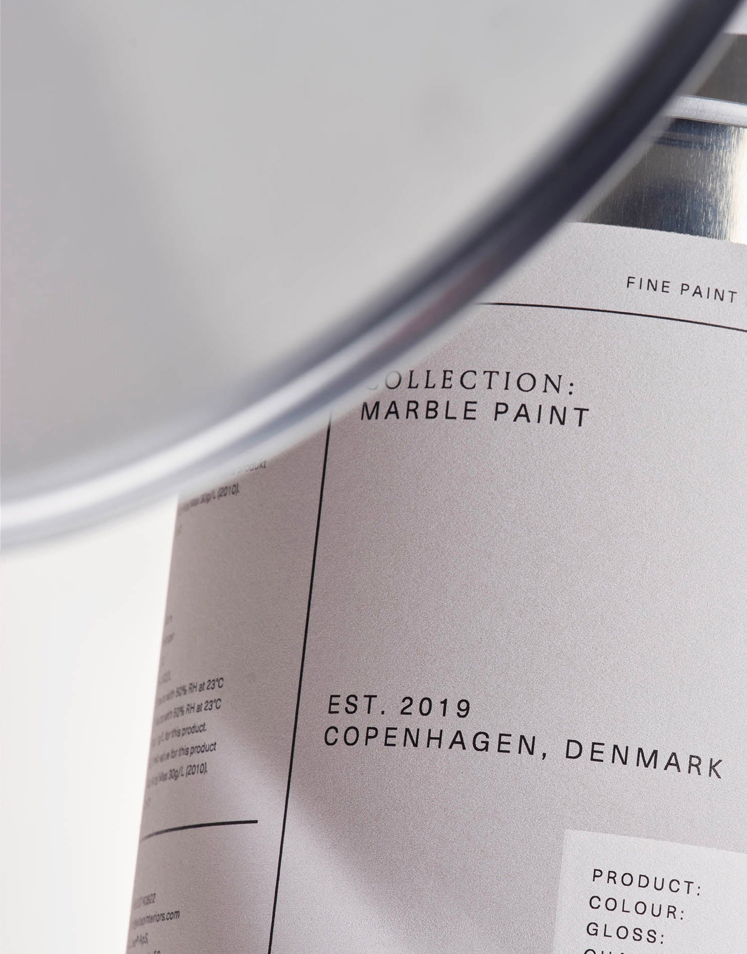
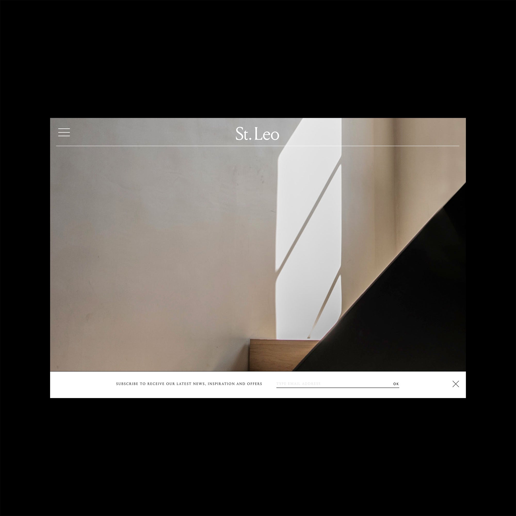
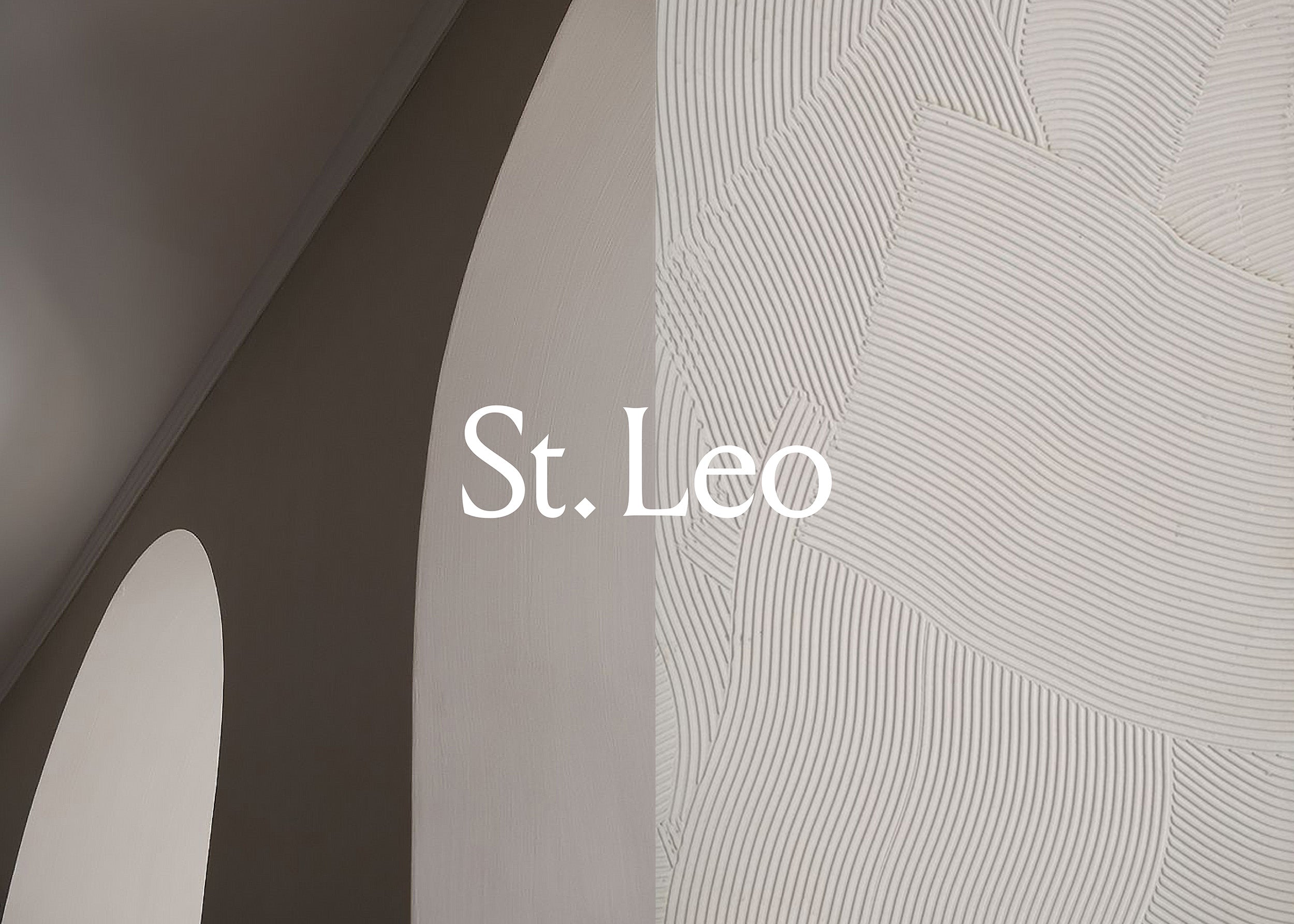
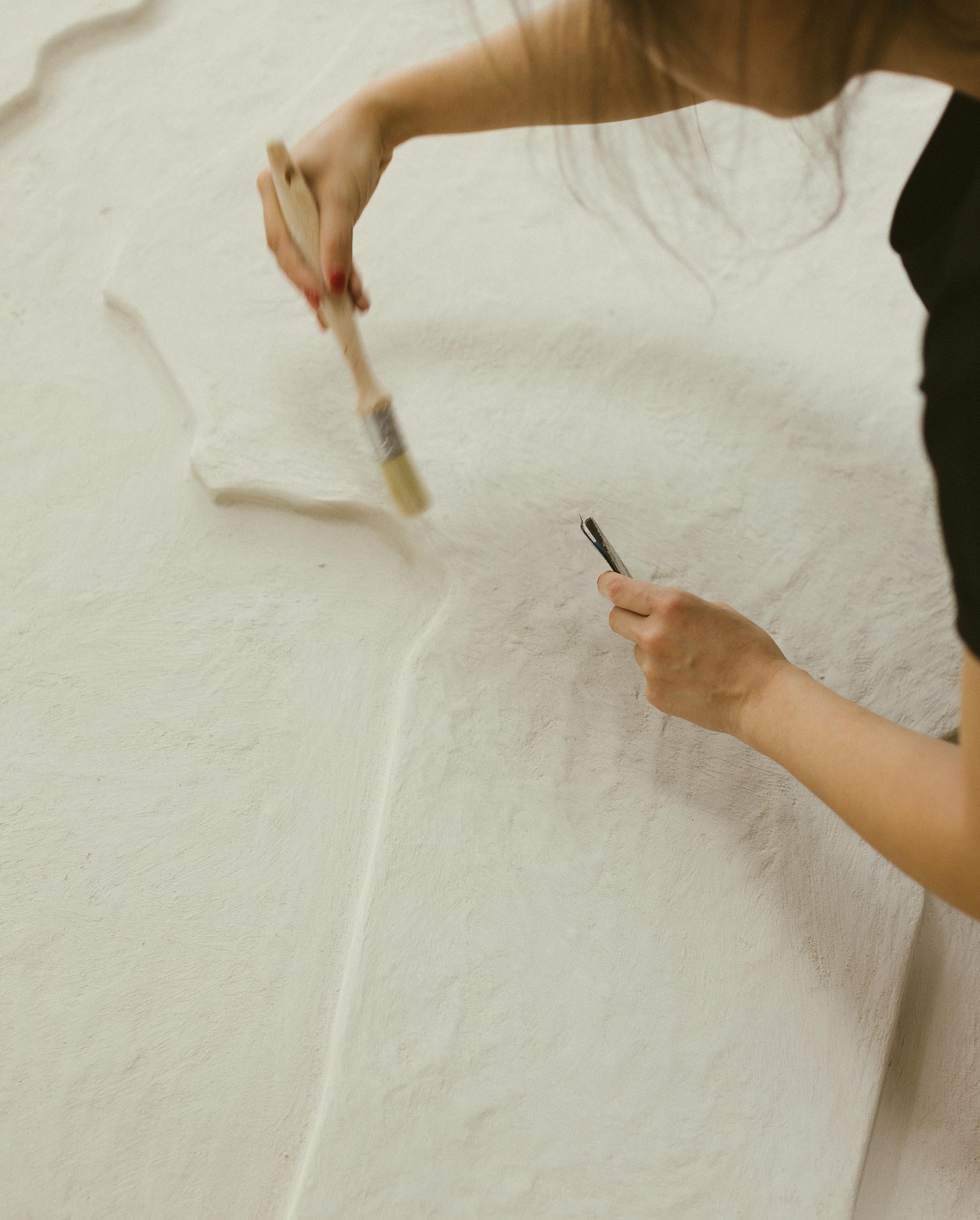
Inspired by culture and derived from nature, St. Leo creates premium, eco-friendly finishes that elevate the experience of architectural spaces. Established in Denmark in 2019, St. Leo draws upon Scandinavian heritage and craftsmanship to produce contemporary paint and plaster from the finest natural minerals with a focus on sustainability, tactility and understated elegance. Alex Hunting Studio were tasked with creating all elements of the visual identity from the outset. We created a comprehensive brand identity that spanned print and digital applications as well as packaging, signage and direct marketing materials.
Read More

Monogram

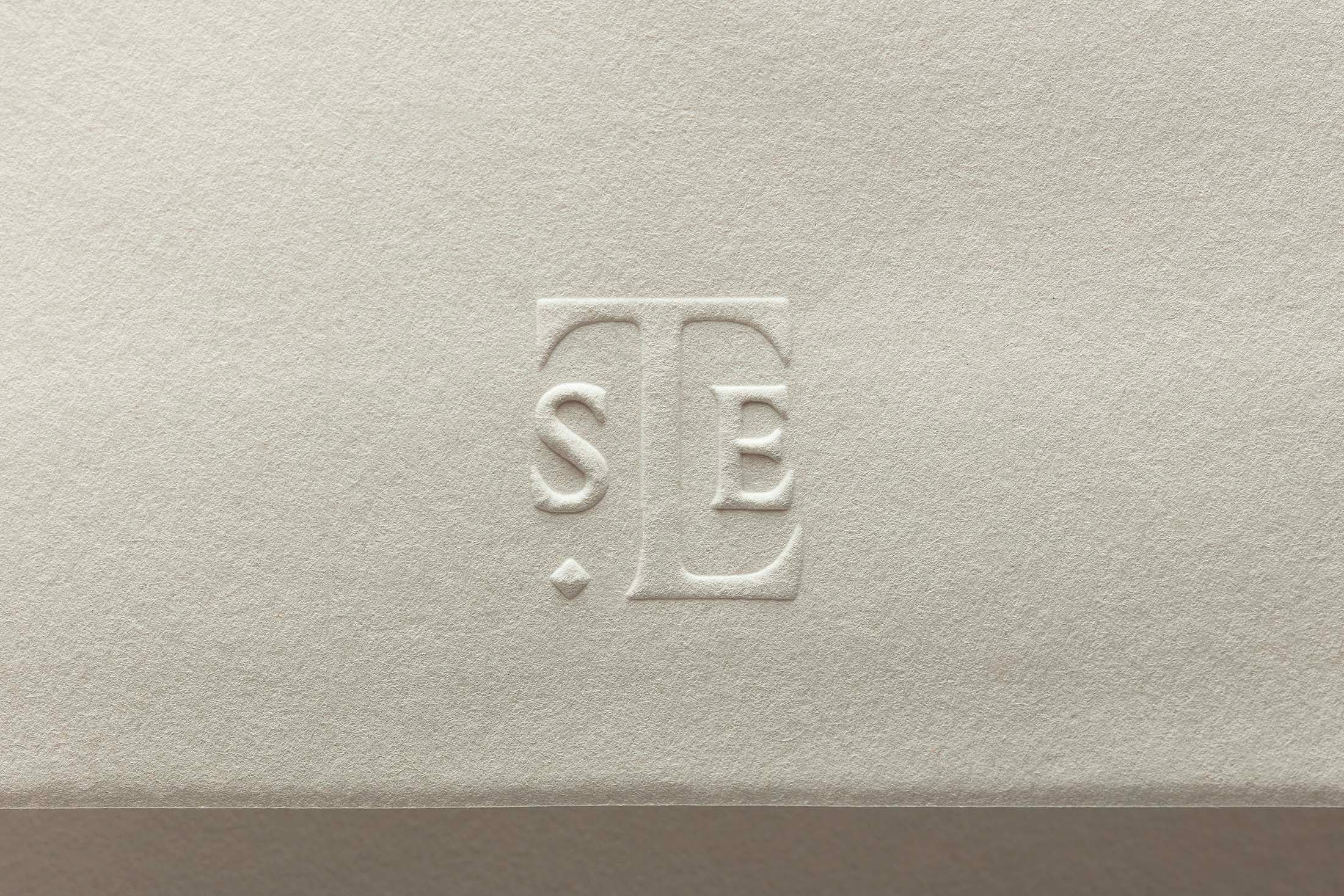
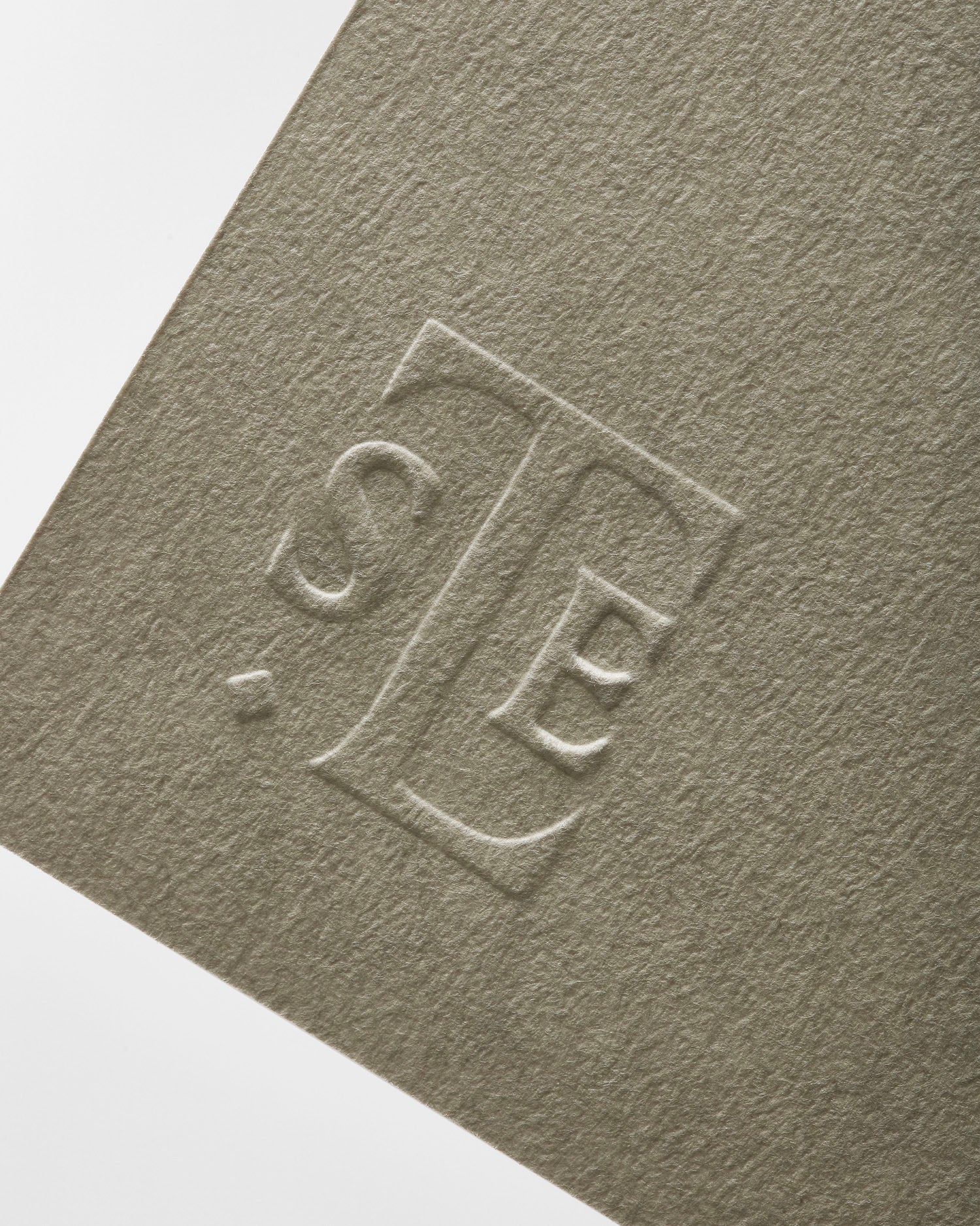
For St. Leo's branding, we developed a unique monogram using the letters S, T, and L. The monogram is sharp and elegant, embodying the essence of the brand. It features a distinct ligature between the T and L and is consistently used across all communications, adding a touch of refinement and cohesion to the brand's identity.

To enhance its impact, we often employ special print finishes such as blind embossing, elevating the monogram and emphasising St. Leo's commitment to quality and craftsmanship.
Credits

Creative Direction:
Alex Hunting Studio
Code:
Neal Fletcher
Discipline:
Art Direction (13) Branding (13) Digital (7)
Client:
Year:
St. Leo
2019
Discipline:
Client:
St. Leo
Year:
2019
Creative Direction:
Alex Hunting Studio
Code:
Neal Fletcher

St. Leo

Brand creation for Denmark’s finest paint + plaster.

Inspired by culture and derived from nature, St. Leo creates premium, eco-friendly finishes that elevate the experience of architectural spaces. Established in Denmark in 2019, St. Leo draws upon Scandinavian heritage and craftsmanship to produce contemporary paint and plaster from the finest natural minerals with a focus on sustainability, tactility and understated elegance. Alex Hunting Studio were tasked with creating all elements of the visual identity from the outset.

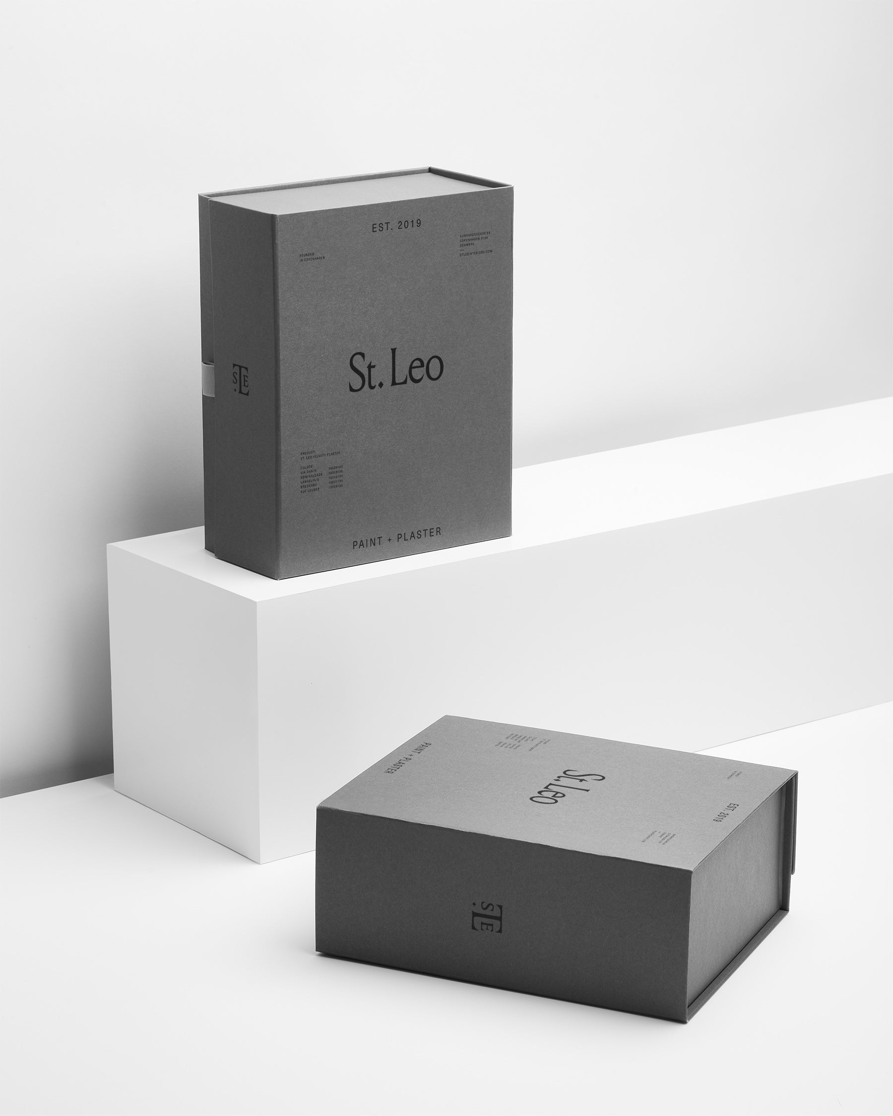
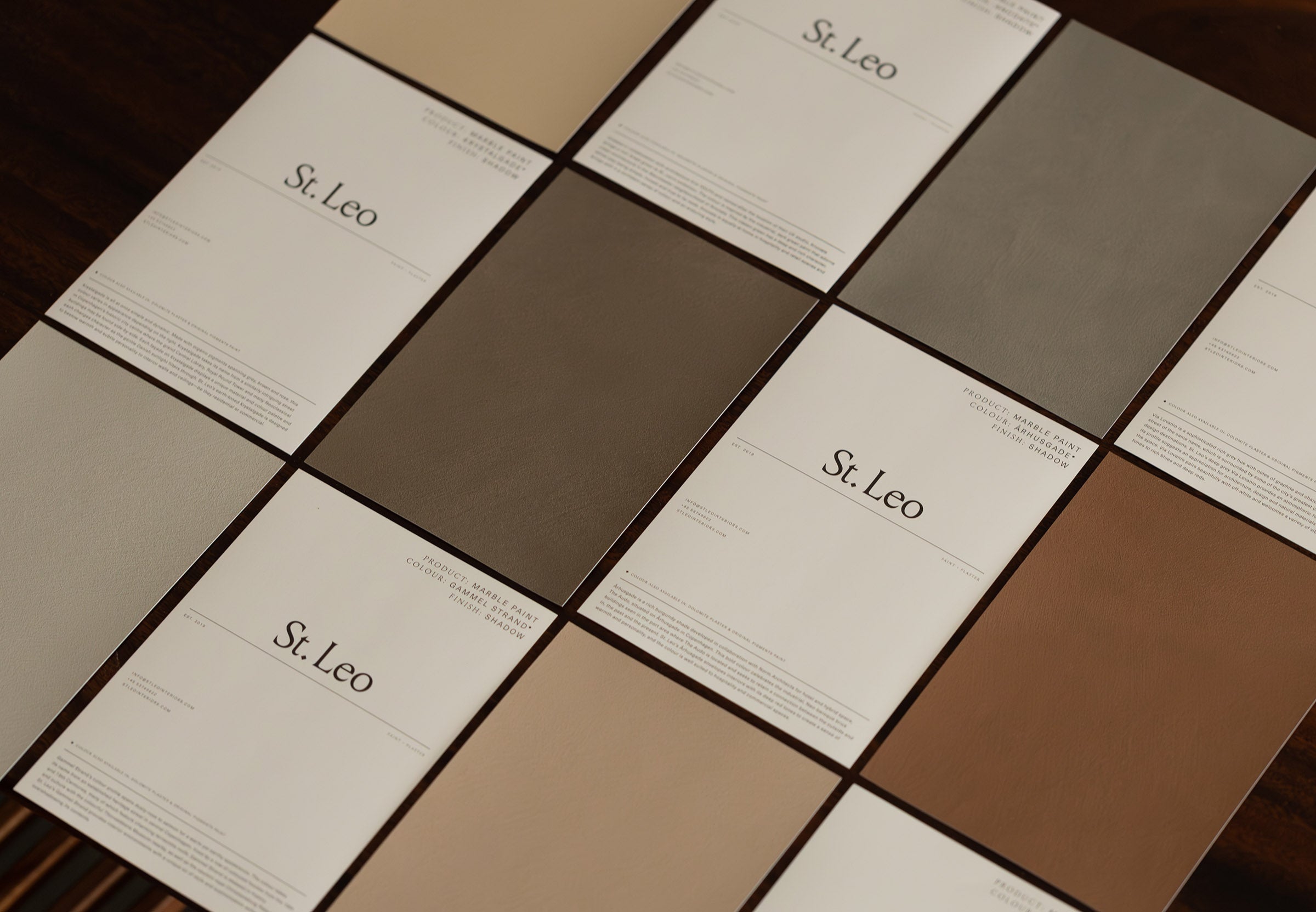
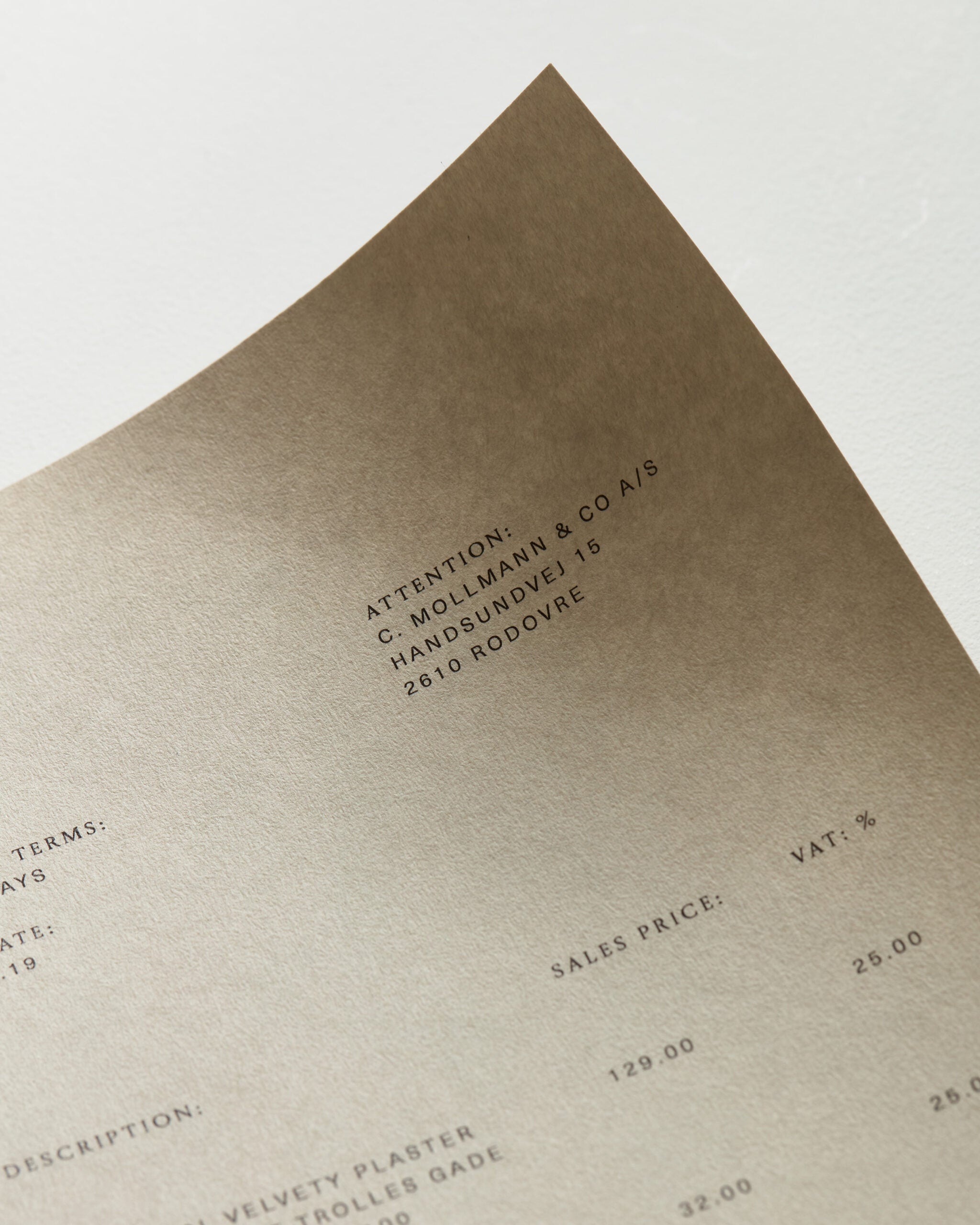
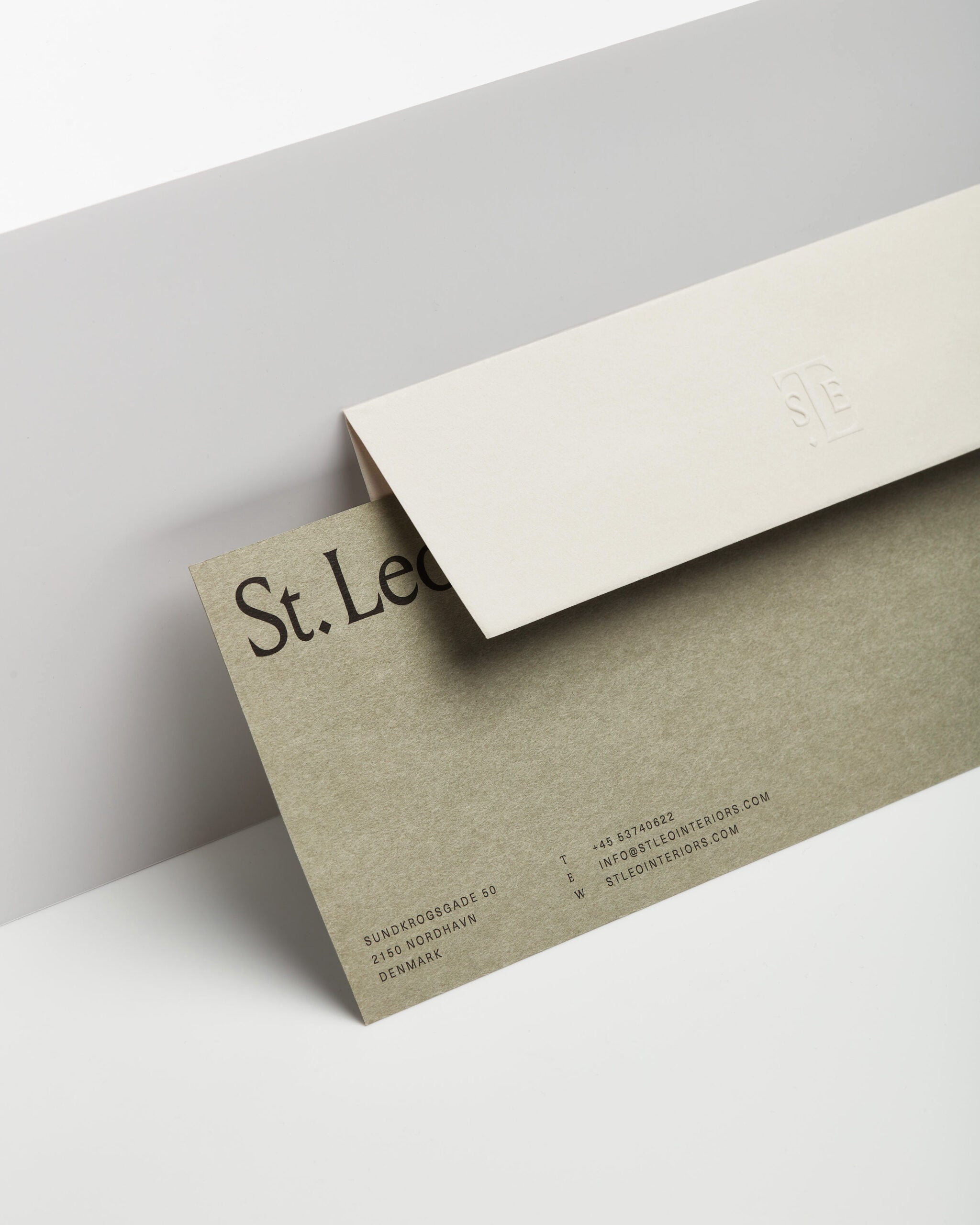
We created a comprehensive brand identity that spanned print and digital applications as well as packaging, signage and direct marketing materials. We also art directed the launch campaign imagery and film. We found inspiration in hand-carved stone lettering as a homage to artisanal stone and plaster craftsmanship. Our references come to life through the elegant application of 205TF’s chiselled serif Louize Display, a beautifully-crafted monogram and a muted colour palette derived from St. Leo’s debut collection. To further echo the raw, crafted nature of the product range, we chose a set of rough and tactile Takeo Satogami paper stocks for the packaging and stationery.