Discipline:
Art Direction
Custom Typography
Editorial Design
Client:
Year:
Rapha
2014-2016

Rapha Mondial

A new print platform for cycling's most iconic apparel brand.

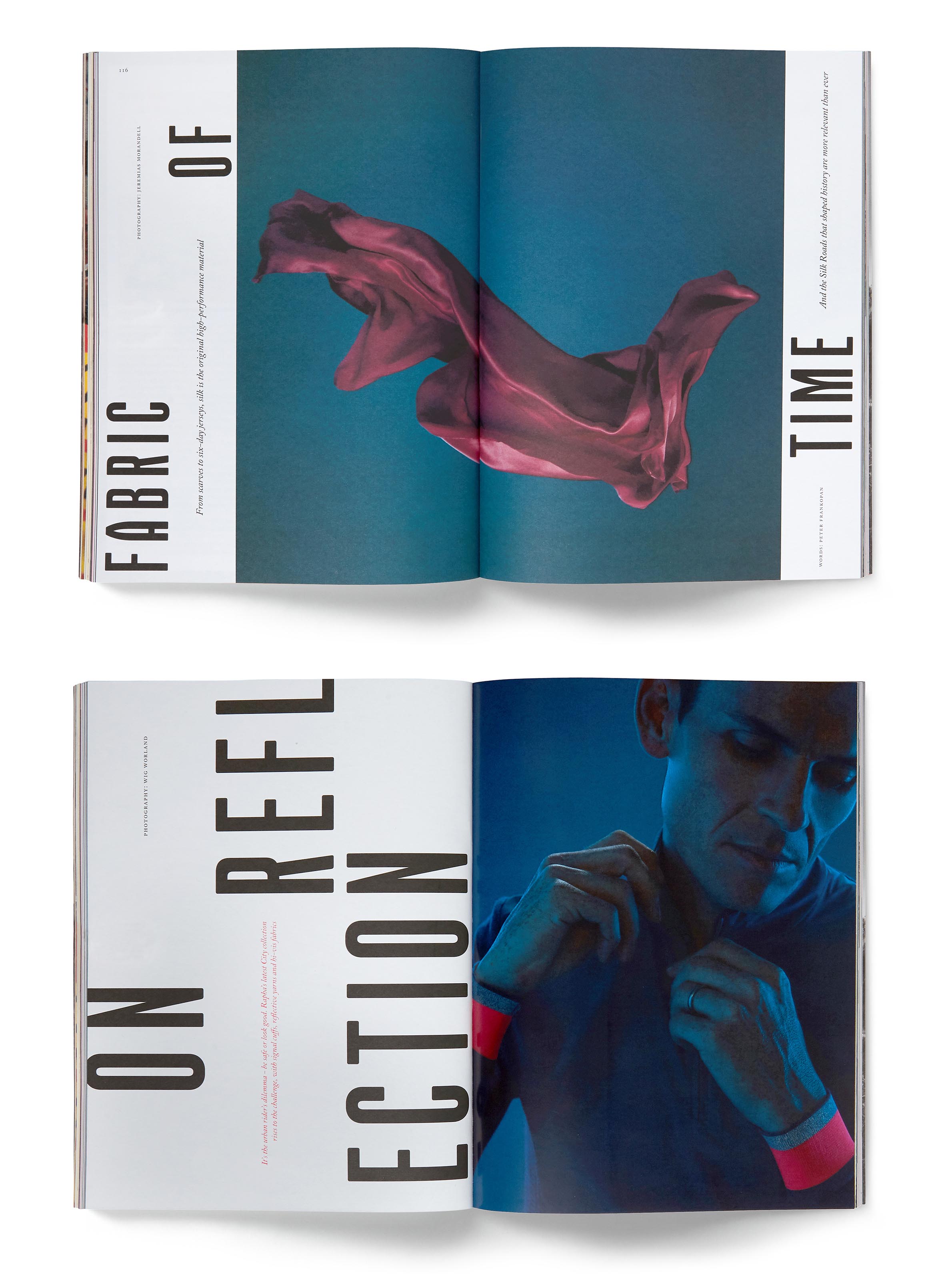
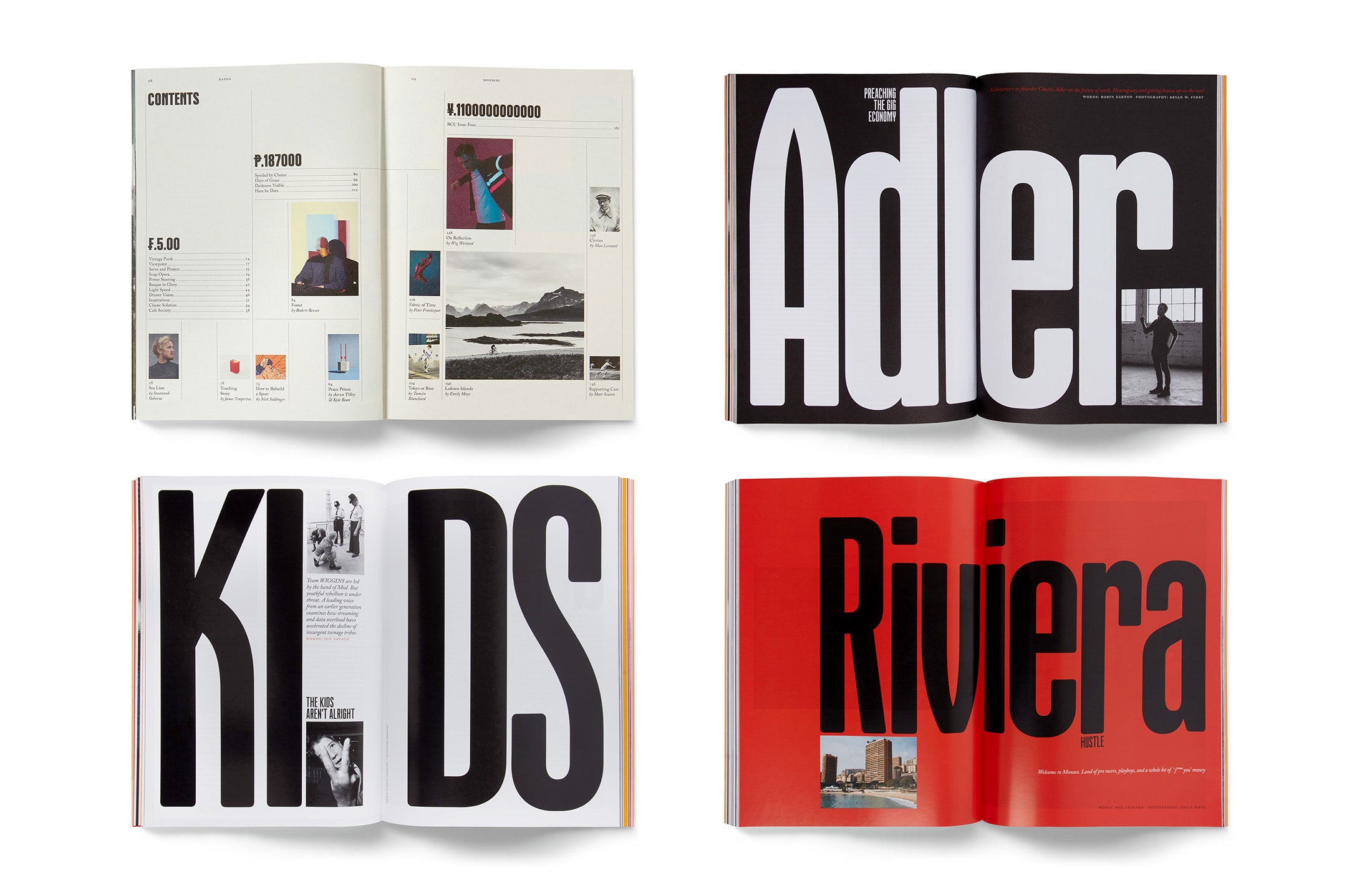
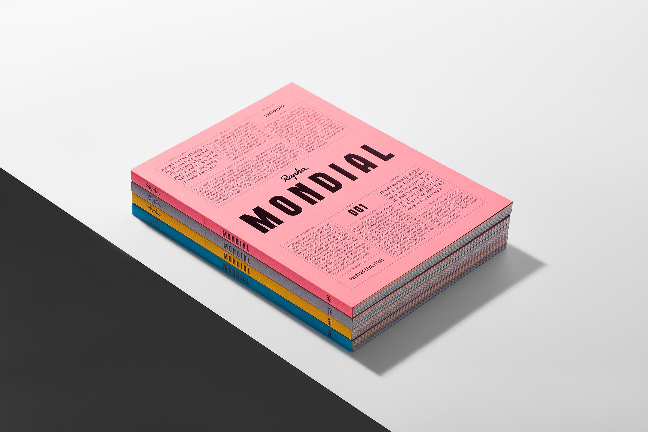
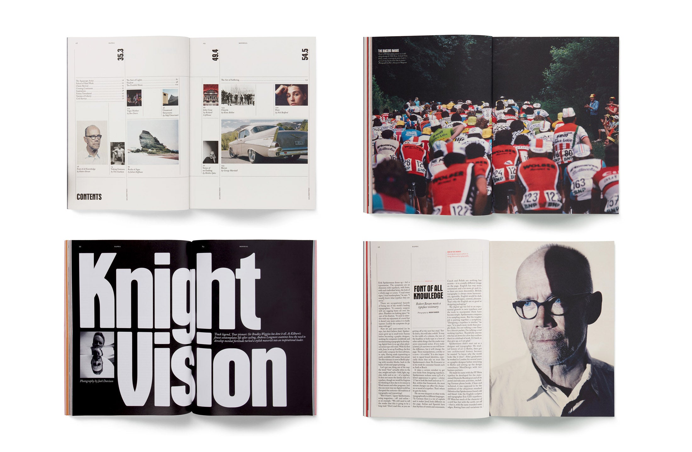
We were approached by Rapha Art Director Jack Saunders to lead the design direction of their new cycling lifestyle magazine Mondial. Mondial expands the idea of what road cycling is and what the sport can be. Featuring incisive longform writing and stunning photography, in Mondial you will find familiar cycling topics given a fresh new treatment.
Read More
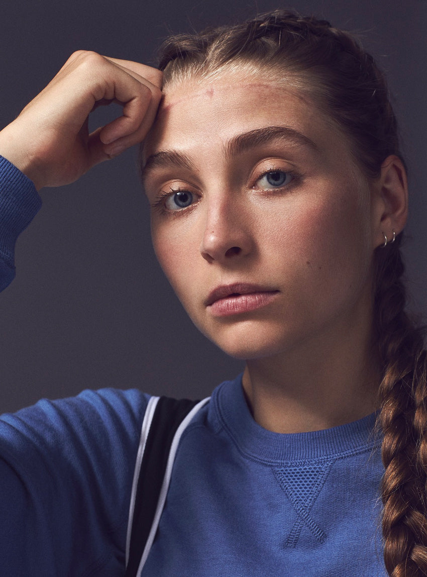
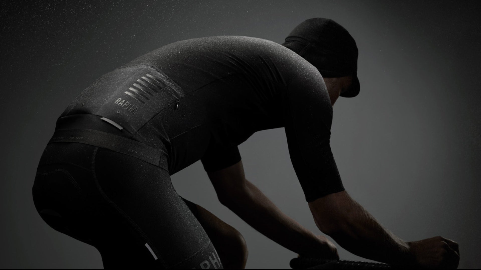
Photo: Michael Bodium for Rapha

"It’s sharp in its editorial curation and rich in commissioned imagery, setting the bar even higher where brand-generated content is concerned."

Its Nice That Press
Previous
/
Next
Section Openers
Previous
/
Next
Various Pages

Issue 2 awarded Graphite Pencil at the D&AD Awards

Magazine & Newspaper Design D&AD Awards (2016)

Previous
/
Next

Issue 2 awarded Gold at the SPD Awards

Society of Publication Designers 2016 Awards
Credits

Art Direction:
Alex Hunting + Jack Saunders
Editor:
Mark Mackenzie
Photography Editor:
Madeleine Penny
Discipline:
Discipline:
Client:
Rapha
Year:
2014-2016
Art Direction:
Alex Hunting + Jack Saunders
Editor:
Mark Mackenzie
Photography Editor:
Madeleine Penny

Rapha Mondial

A new print platform for cycling's most iconic apparel brand.

We were approached by Rapha Art Director Jack Saunders to lead the design direction of their new cycling lifestyle magazine Mondial. Mondial expands the idea of what road cycling is and what the sport can be. Featuring incisive longform writing and stunning photography, in Mondial you will find familiar cycling topics given a fresh new treatment.

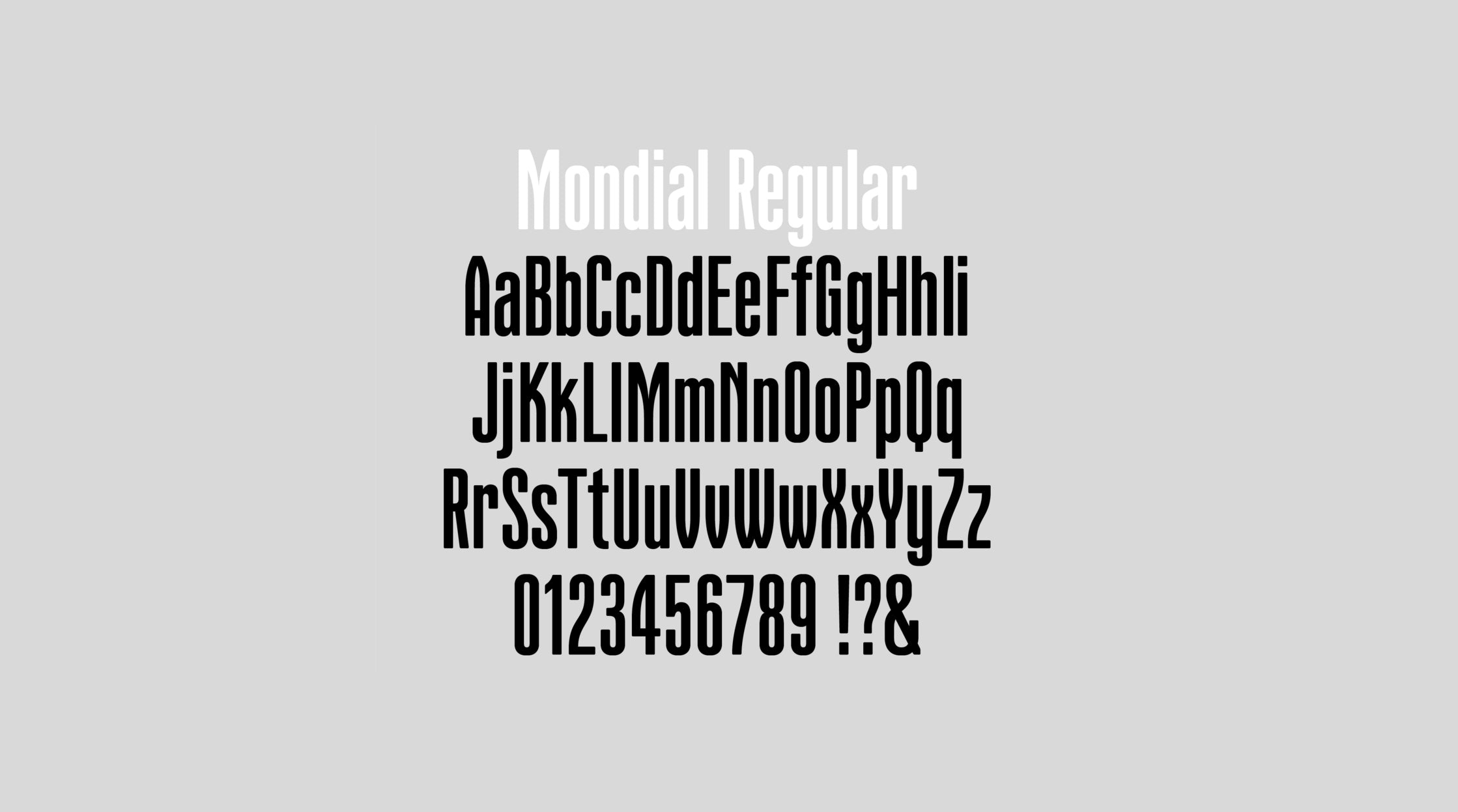
The typography of Mondial magazine is a deliberate homage to cycling heritage and Rapha's brand identity. Inspired by vintage cycling literature, the magazine's typefaces were meticulously crafted to evoke a sense of nostalgia and sophistication. The all-caps 'MONDIAL' setting, influenced by the characters of La Gazetta Dello Sport's vintage typography, features unexpected sloping behaviours in select letterforms, setting the tone for the magazine's typographic narrative. The team commissioned type foundry Colophon to evolve the initial wordmark into a comprehensive display alphabet and ultimately a bold weight. Additionally, the introduction of a condensed weight in Issue No. 2 expanded the typeface's versatility, adding a new visual texture and enabling fresh editorial possibilities.