Discipline:
Branding
Custom Typography
Editorial Design
Client:
Year:
Kinfolk
2018-24

Kinfolk

Design direction for the world’s most influential lifestyle magazine.

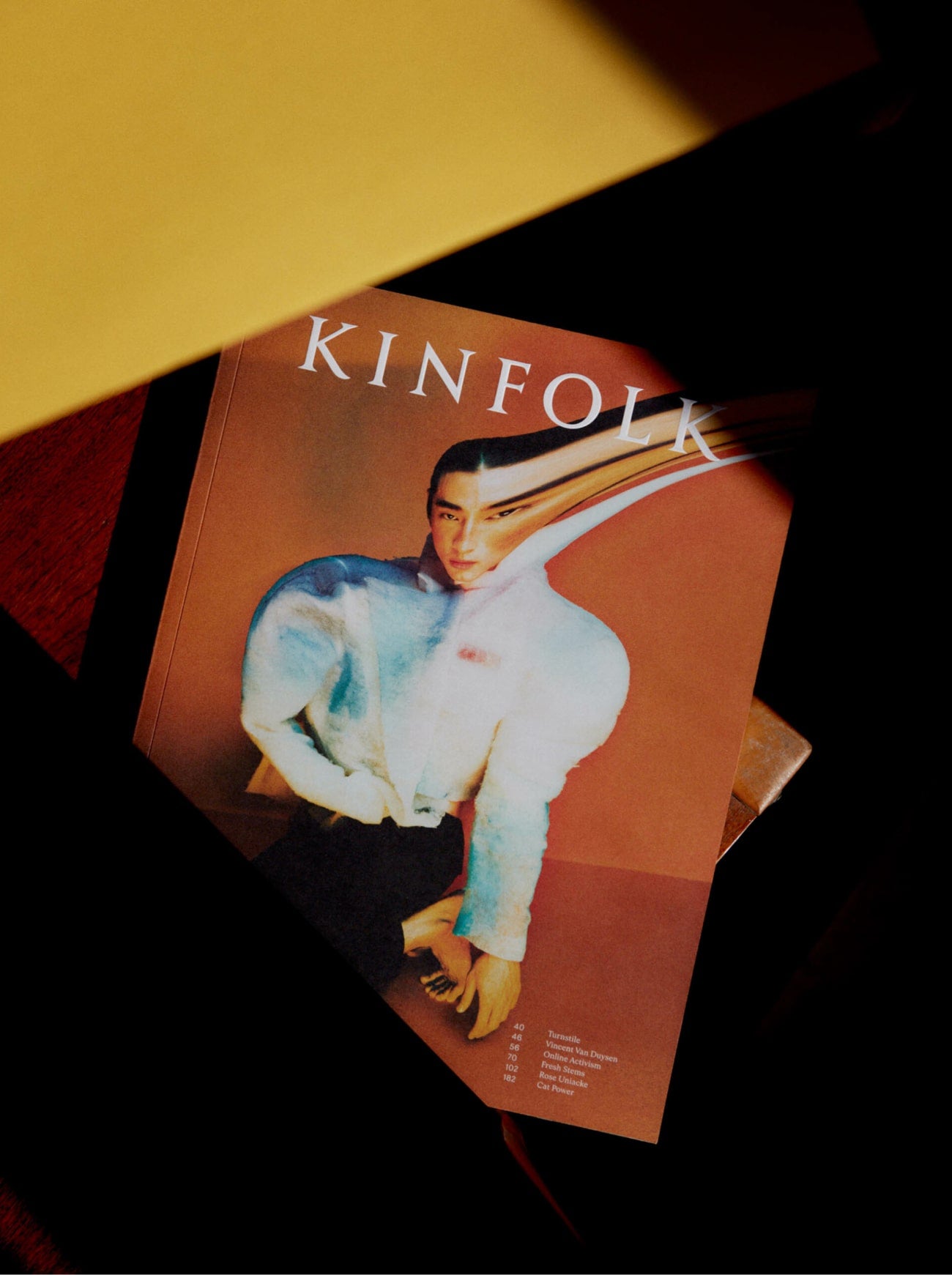
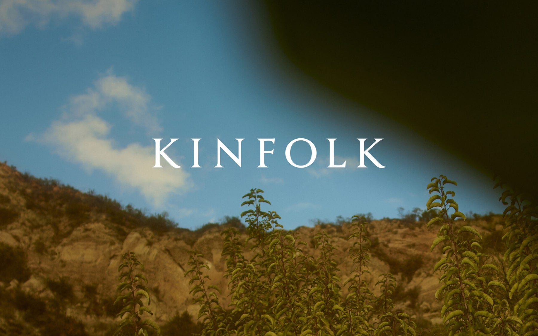
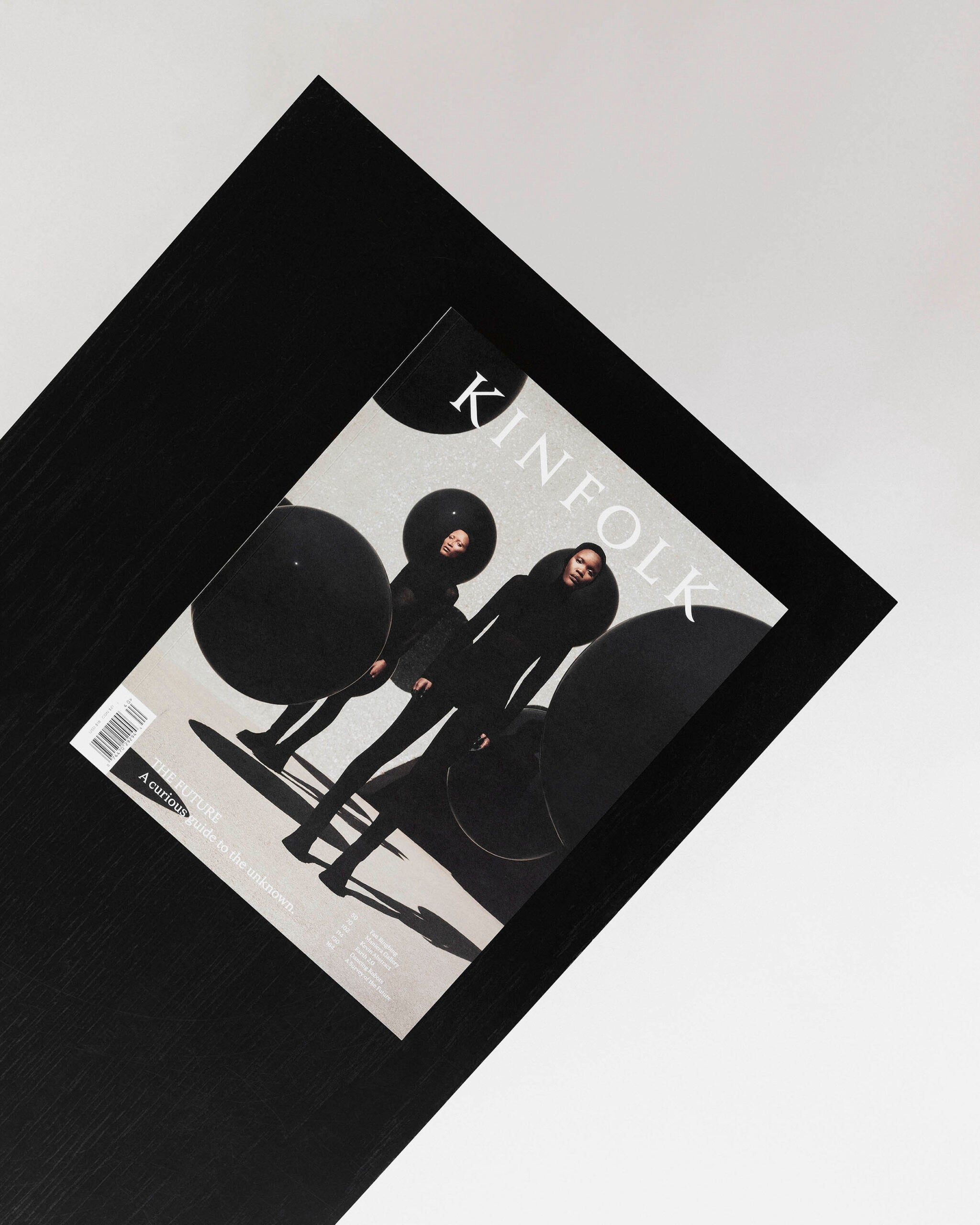
Design direction for one of the world’s leading lifestyle authorities. Kinfolk’s quarterly magazine is sold in over 100 countries in four languages. Since our last award winning redesign in 2016 we have further evolved and refined Kinfolk’s unique and distinct visual language. To celebrate Kinfolk’s 10 year anniversary we delivered a brand new redesign in the Summer of 2021.
Read More
Case Study Photo: Christian M. Anderson

“A magazine that helped define a generation’s aesthetic.”

Vanity Fair Press
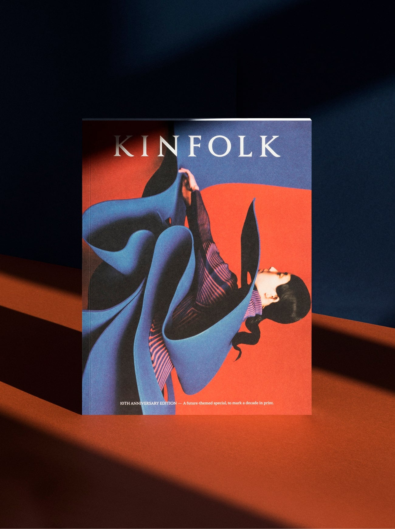
(Left) Cover Photo: Zhong Lin. (Right) Cover Photo: Zhong Lin
Previous
/
Next
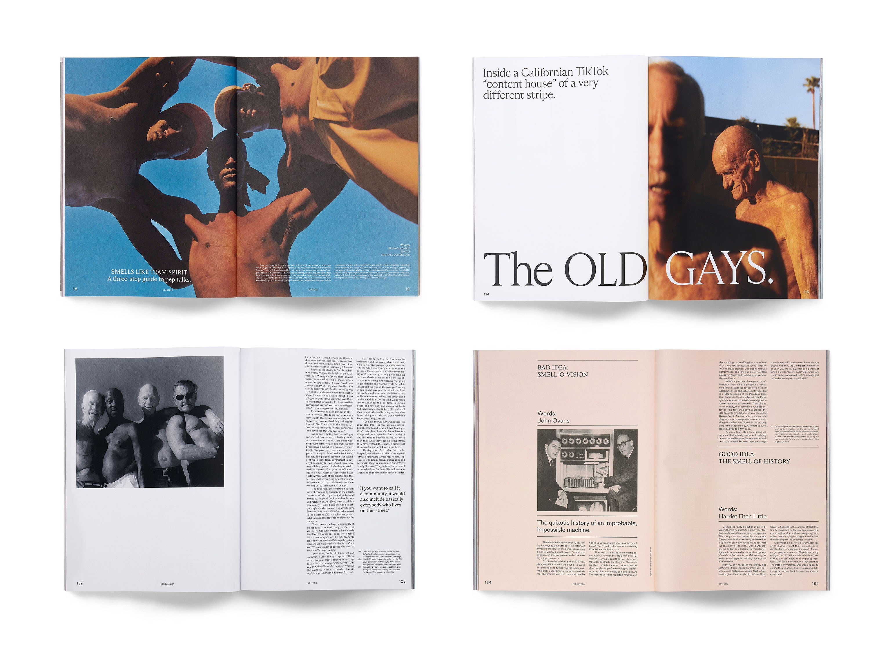
Front of book pages
Photos: Emman Montalvan

“As Kinfolk’s design director, Alex has been a positive force of change for the company and brand, helping us expand our creative vision and serving as the architect of our magazine’s redesign.”

Nathan Williams Founder, Kinfolk
Previous
/
Next
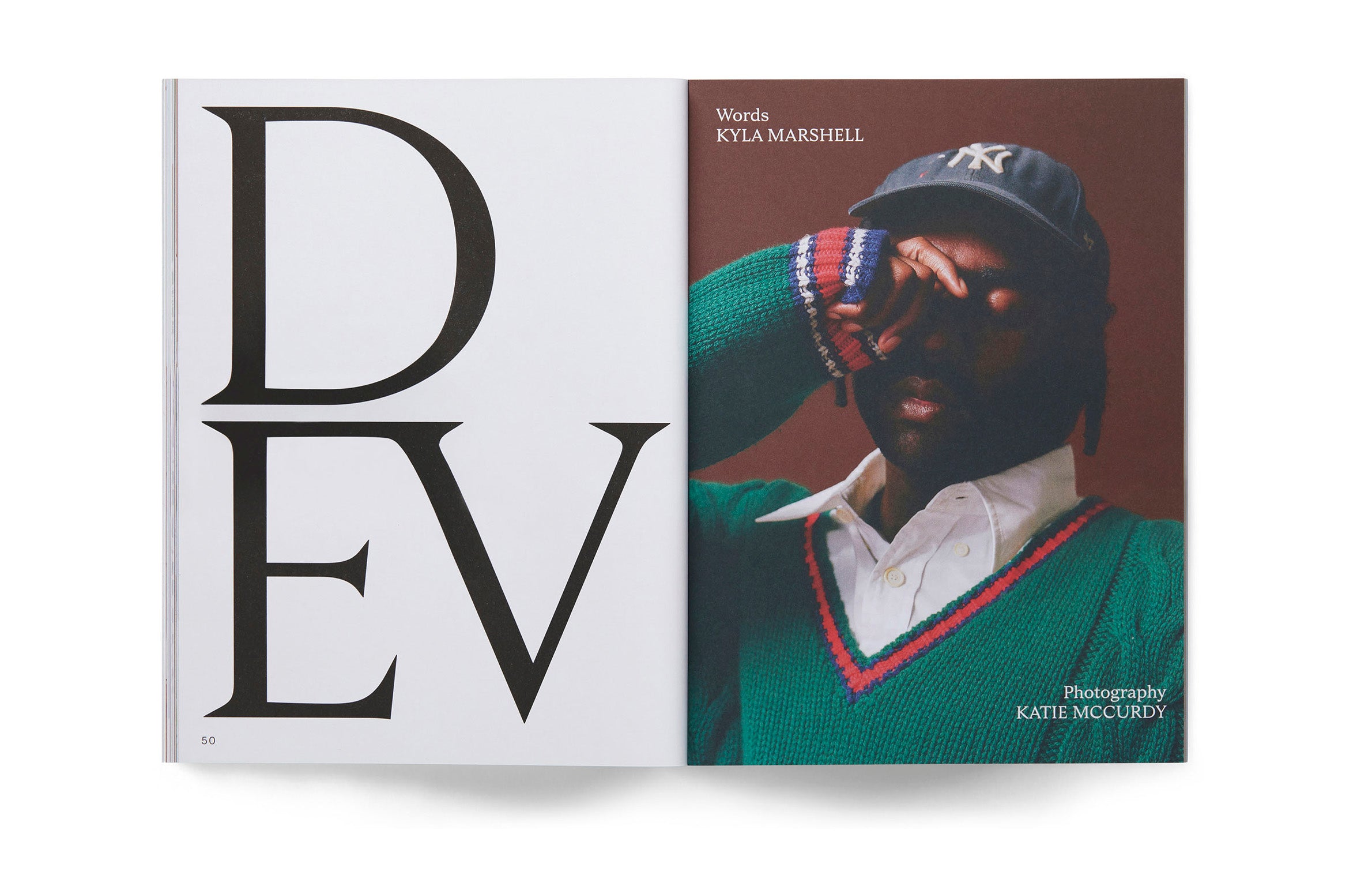
Feature Pages

Credits

Design Director:
Alex Hunting
Editor in Chief:
John Clifford Burns
Editor:
Harriet Fitch Little
Art Director:
Christian M. Anderson
Publisher:
Chul-Joon Park
Typeface Design:
Schick Toikka
Publication Design:
Alex Hunting Studio
Discipline:
Discipline:
Client:
Kinfolk
Year:
2018-24
Design Director:
Alex Hunting
Editor in Chief:
John Clifford Burns
Editor:
Harriet Fitch Little
Art Director:
Christian M. Anderson
Publisher:
Chul-Joon Park
Typeface Design:
Schick Toikka
Publication Design:
Alex Hunting Studio

Kinfolk

Design direction for the world’s most influential lifestyle magazine.

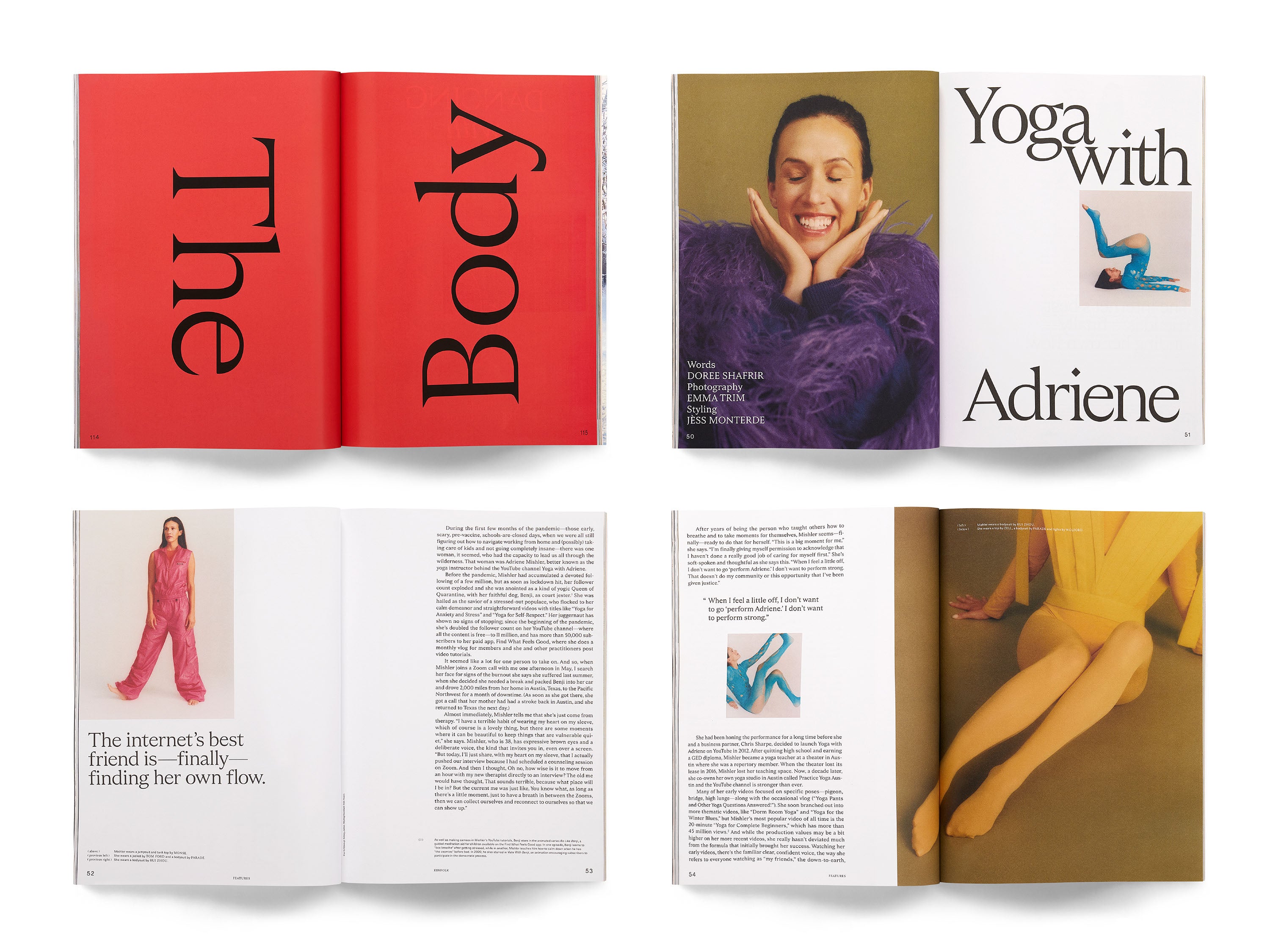
Design direction for one of the world’s leading lifestyle authorities. Kinfolk’s quarterly magazine is sold in over 100 countries in four languages. Since our last award winning redesign in 2016 we have further evolved and refined Kinfolk’s unique and distinct visual language. To celebrate Kinfolk’s 10 year anniversary we delivered a brand new redesign in the Summer of 2021.

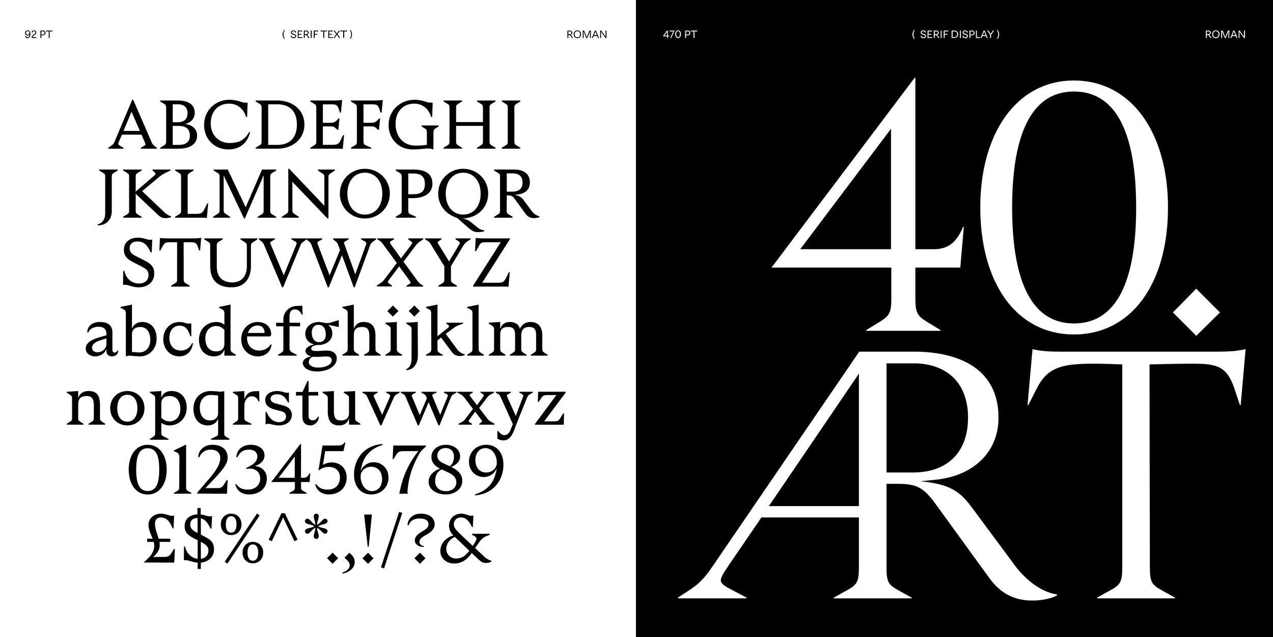
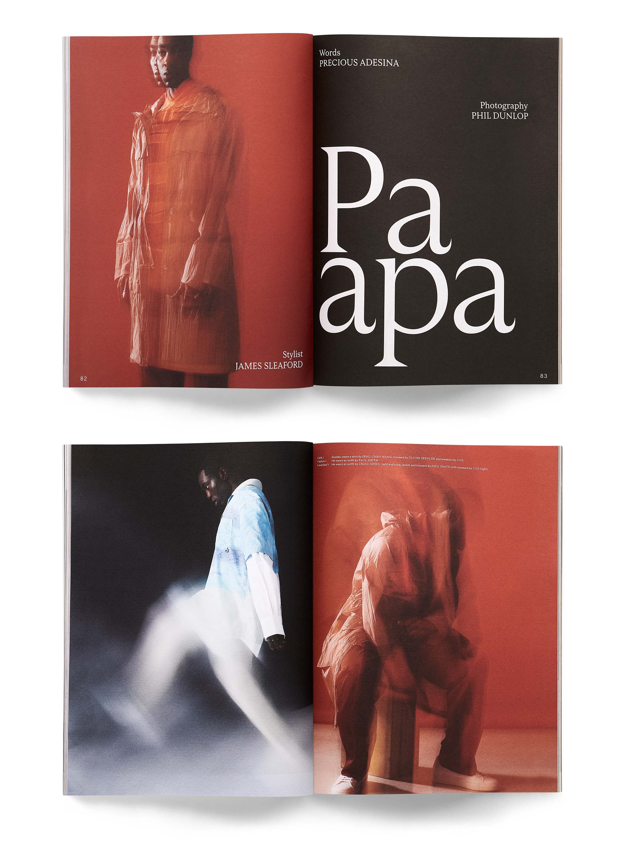
We overhauled the entire magazine, introducing a new grid, paper stocks, logo, and custom typefaces. We collaborated with the brilliant Schick Toikka type foundry to produce a complete family of typefaces. The custom type family consists of 6 different styles, a Serif and a Sans counterpart with matching italics. The Sans and the Serif fonts share the same vertical dimensions and similar overall proportions, so they can be mixed together harmoniously. The Serif version of the fonts feature a Text style, designed specifically for body copy, captions and small headlines, and a Display style with higher contrast and slightly lighter weight intended for bigger point sizes. The display version also features set of cap ligatures. Together the fonts create a compact but versatile palette that serves all the typographic needs of the magazine, from impressive headlines to longer articles.